Tuesday, 28 February 2012

Buttons/symbols

Okay, so every app has a means to return to the home screen and progress to the next screen... I forgot about this! SO... I will devote some more time to it that usual, as an apology to the world of buttons.
The previous symbols that I used on the interface didn't need to much research as they were relatively specific to my project, but home buttons etc are found everywhere. So I thought I'd give it a bit of research an dpost some of my findings here. I think the classic home button image-of-a-wee-house will actually link quite well, even though it is a little cheesy. When I have decided on the style I will draw out the symbols the same way as the interface ones (pencil, then fountain pen, then scan) to ensure continuity.

Examples:
Shiny ones. not what I'm going for.



These are a biut more like it, although I'd make them a bit more rustic looking.

The last one is my favourite, tkis kind of symbol but hand drawn is what I am going for.

Arrow/next examples:
This is the obvious style I would go there, but I am keen to check if there is anything out there that is a bit more inspiring. If not, this style is fine.
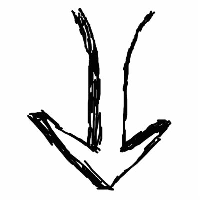

These are a bit more inspiring.. now to the sketchbook.


Friday, 10 February 2012

Watery experiments and tests

So, to create the whisky spill map I'm going to base the animation around a video of liquid opuring/spilling.
Here are some tests/investigations done using coloured water:
I started at first with water pouring over a ridged tinfoil surface, from this I moved on to coloured water, then coloured water thickened, to make it clearer and more whisky like. I then experimented with filming a plastic bottle being knocked over and finally a glass bottle being knocked over and spilling the contents. The videos have gone in the wrong order, annoyingly!